12-Hexagon Color Wheel Rainbow; AKA the “Wobbly Circle”
Most of my quilts have an underlying hexagonal structure (even if the hexagonal structure is not immediately noticeable).
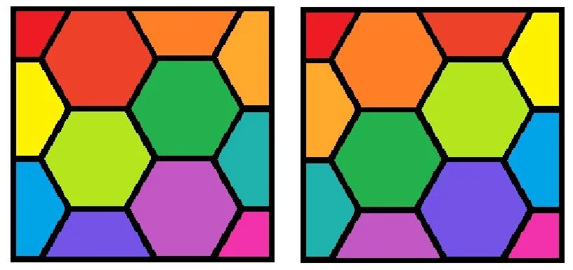
I love to make mini quilts (and pillows), and I usually want to end up with a quilt that is in the shape of a square (or as near to a square as possible). A good way to do this when the underlying structure is hexagonal, is to make the height 2.5 hexagons high, and have two full columns of hexagons with a half-column on each side:
If s is the side length of your hexagon in inches, the finished quilt will be 4.33s” high and 4.5s” wide. So for example if the underlying hexagons have 4” sides, your finished quilt will be 17.3” x 18”. Not exactly a square, but close enough. If I absolutely need a square (for a pillow, for example), I just add a border that is a little narrower on the wider part of the quilt. It also doesn’t have to be a mini! I’ve made a baby quilt with this structure (hexagon side 8.67”, quilt size 37.5” x 39”), and I’m in the process of making an even larger quilt where the underlying hexagons have 15” sides.
Here is an example of a mini quilt I made with exactly this structure:
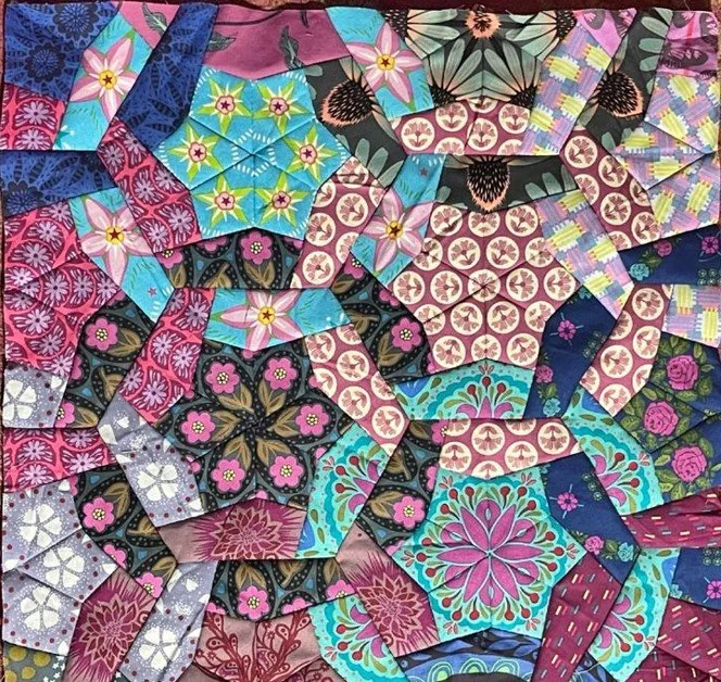

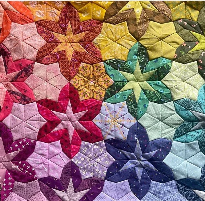
There are 12 full and partial blocks here (two quarter blocks, four full blocks, and six half blocks). Coincidentally, there are 12 colors on the color wheel: red (R), red-orange (RO), orange (O), yellow-orange (YO), yellow (Y), yellow-green (YG), green (G), blue-green (BG), blue (B), blue-violet (BV), violet (V), and red-violet (RV). A 12-hexagon mini is a perfect medium for a rainbow quilt, where each color has its own block. The question is, how do you place the colors? My first instinct was to place the colors in order, going down either diagonally or from left to right then top to bottom:
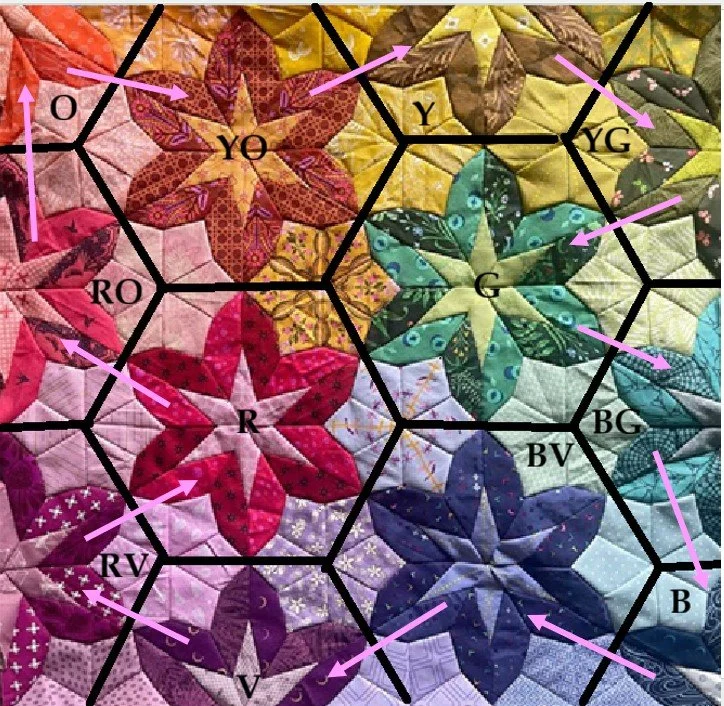
The problem here is that I don’t like the fact that you will always end up with two colors that are next to each other on the color wheel but on opposite sides of the quilt (in the two pics above, Y and YO are on opposite sides of the quilt, as are B and BG). These gradients work well on larger quilts with many more hexagons – even though you do get those “jumps” to opposite sides of the quilts, there are multiple hexagons in each color category and it works out well in the end. But when there is only one block in each color, I want all the colors that are next to each other on the color wheel to be next to each other in the quilt. There is a way to do that, moving around the quilt in kind of a wobbly circle like this:
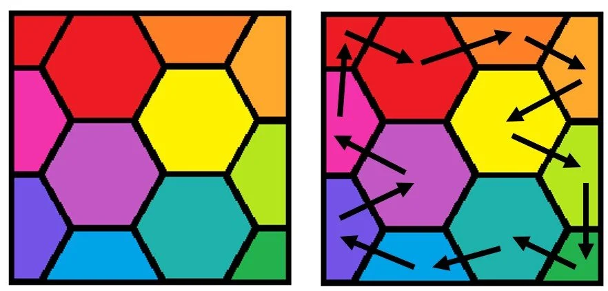
Of course, you don’t have to start with red in the corner, either. Put red anywhere you want, then follow the arrows. You can also go around the color wheel in either direction: the color after red in the direction of the arrow can be either RO or RV – you just have to stick with whichever direction you chose for the whole circle.
The four full hexagon blocks will always end up equally spaced around the color wheel. There will be two pairs of complementary colors, one made up of a primary (R, B, or Y) and a secondary color (G, O, or V), and the other pair made up of tertiary colors (RO, YO, YG, BG, BV, RV). There are three ways it can turn out: R-YO-G-BV, B-RV-O-YG, or Y-RO-V-BG.
How do I choose my starting hexagon and my direction? Usually, there will be constraints that force me into a choice. There will often be one color where I have so little of the fabric I’ve chosen for it that it needs to be a quarter block, and one or two other colors that need to be half blocks for the same reason. If I don’t have any limiting constraints, I will instead try to maximize the number of my favorite fabrics that end up in the full hexagon blocks. Once I have my starting block and my direction chosen, I will orient my quilt so that the lighter colors (generally O, Y, YO and YG) end up at or near the top, and the darker colors (generally B and BV) end up near the bottom – the quilt just looks more natural to me that way.
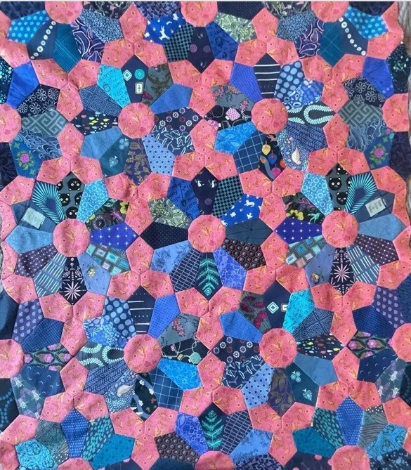
As an example, this is the baby quilt I made using this method (the same baby quilt that I mentioned earlier):
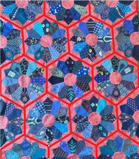
And here is the underlying structure:

The octagon is a fairly large piece, and I specifically wanted to use it to show off some larger scale prints. I had bought a fat eighth (or maybe it was even fat sixteenth?) bundle of cute novelty fabrics which included the ones in the Y and BG blocks. I didn’t have enough of either print to cut 6 octagons, so they couldn’t be full blocks. They could have been quarter blocks, but I wanted to maximize the use of those prints and make them both half blocks. I also wanted a YG full block, since I had just bought that Maureen Cracknell print and wanted to showcase it. I also skewed the colors a little bit to make it all work. My R-RV-V-BV are more like RV-slightly reddish V-slightly bluish V – very bluish V. But RV had to be a full block, and I didn’t have enough of the Lizzy House cats to make a full block. Plus, I got to use the princesses! The takeaway here is that the colors don’t need to be exact, as long as they move around the color wheel in the right direction.
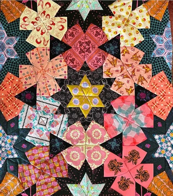
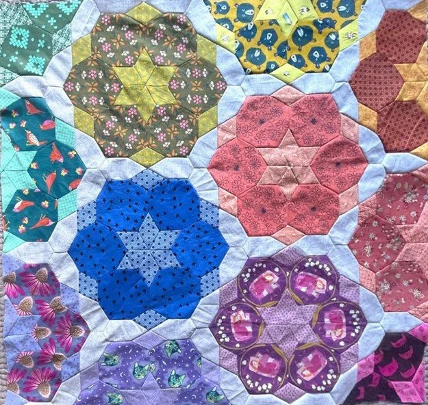
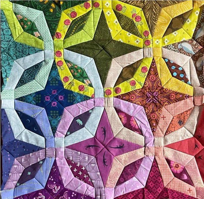
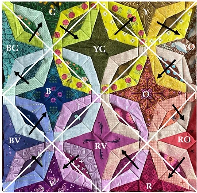
Here’s a second example – a mini quilt:
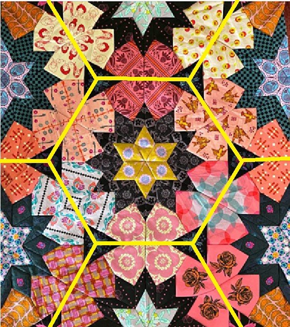
And here is the underlying structure:
I didn’t have any limiting constraints here, but the G block was my favorite, so I made that one a full block. One thing that makes this different from the previous quilt is that there is no neutral background fabric; the kite stars here are also colored and have a rainbow progression. I use what I call the “averaging method” to choose colors for background pieces that are “between” or shared by the underlying hexagons. In this case, each kite star is shared by three underlying hexagons (or two for the half stars on the edges). So for example, the cute 30’s floral that is between the R, V and BV flowers is a true violet: the average of R and V is RV, and the average of RV and BV is just V. The one place where the averaging gets weird is when a piece is shared by hexagons that have complementary colors. Complementary colors cancel out, so their average is nothing. The Heather Ross “Malibu” star between the R, G and YO flowers is YO because the R and G cancel each other out, leaving only YO. If you have background pieces that are shared by two complementary hexagons and no other hexagons (which does not happen in this particular quilt), you can use a gray print (or white or black if you need it to be very light or dark).
The 12-Square Wobbly Circle
The “wobbly circle” color placement method also works when the underlying structure is a square on point, like this:
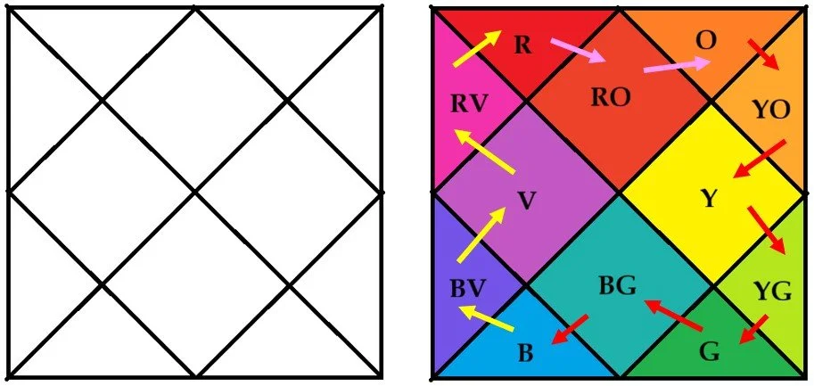
As with the hexagons, you will end up with two pairs of complementary colors in the full squares. Here’s an example of a mini I made using this method:
And here is the underlying structure:
The 4-point stars are a dark value of each color, and the “wheels” around them are a light value of each color. The colors for the diamonds should have been chosen using the averaging method (with each diamond shared by two squares), but in reality I just kind of eyeballed it. Eyeballing is easy when it’s between only two things. When it’s three things I’m more careful about working out the average. The four diamonds in the middle are the same as the four diamonds in the corners, even though the averaging is not quite the same. For example, the green Heather Ross “Malibu” diamond is between the BG and G blocks (the average of BG and G is a slightly bluish green), and also between the B and YG blocks (where the average is a true green). As long as a piece between two squares is somewhere between the two colors of the squares, it will work.
Happy making! If you use this method, please tag me so I can see it in action! :)